In this article
- 1. It Is Built for the Phone First
- 2. It Loads Fast
- 3. The First Screen Answers Three Questions
- 4. Every Page Has One Clear Next Step
- 5. Your Phone Number Is Tappable
- 6. Customers Can Book Online
- 7. Your Forms Are Short and Go Somewhere
- 8. Visitors Can Ask a Question Right Now
- 9. Your Reviews Are Front and Center
- 10. The Photos Are Real
- 11. Search Engines Can Understand It
- 12. You Can Change It Without a New Quote
- Bonus: You Can See What It Is Doing
- Common Website Design Mistakes
- How We Design Small Business Websites
- A Quick Small Business Website Design Checklist
- Frequently Asked Questions
- The Bottom Line
Good small business website design is not about the latest trend or the cleverest animation. It is about one thing: turning the people who visit your site into people who contact you. A site can win design awards and still lose customers if it is slow on a phone, hides the phone number or makes booking a chore.
We design and build websites for local service businesses across the country, and we see the same gaps over and over again. Most of them are easy to fix once you know what to look for.
Here are the twelve things every small business website needs, in the order a visitor actually experiences them.
Key takeaways
- Most of your visitors are on a phone. Design for the phone first, then the desktop.
- A visitor should know what you do, where you do it and how to reach you within five seconds.
- Every page needs one clear next step, and every enquiry needs to land somewhere your team will see it.
- Reviews, real photos and fast answers do more to win customers than any design trend.
1. It Is Built for the Phone First
Most people who find a local business do it on their phone, often while they are standing somewhere deciding what to do. Your website has to work perfectly on a small screen: text you can read without zooming, buttons big enough to tap, and nothing that slides off the side of the screen.
Design for the phone first, then make it beautiful on a desktop. Doing it the other way round is how sites end up with tiny buttons and menus nobody can use.
2. It Loads Fast
A slow website loses visitors before they see a single word. Large uncompressed images, too many plugins and heavy animations are the usual causes. Every image should be sized for the web, and every page should feel instant on a normal phone connection.
3. The First Screen Answers Three Questions
Within five seconds of landing, a visitor should know what you do, where you do it and how to reach you. Put those three things on the first screen of your homepage, in plain words. "Family dentistry in Fort Lauderdale, open Saturdays" beats "Excellence in care" every time.
4. Every Page Has One Clear Next Step
Every page should end with a clear next step: book, call, or send a message. Make the main button stand out in your brand color, and repeat it at the top and bottom of long pages. If visitors have to hunt for how to contact you, many will not bother.
5. Your Phone Number Is Tappable
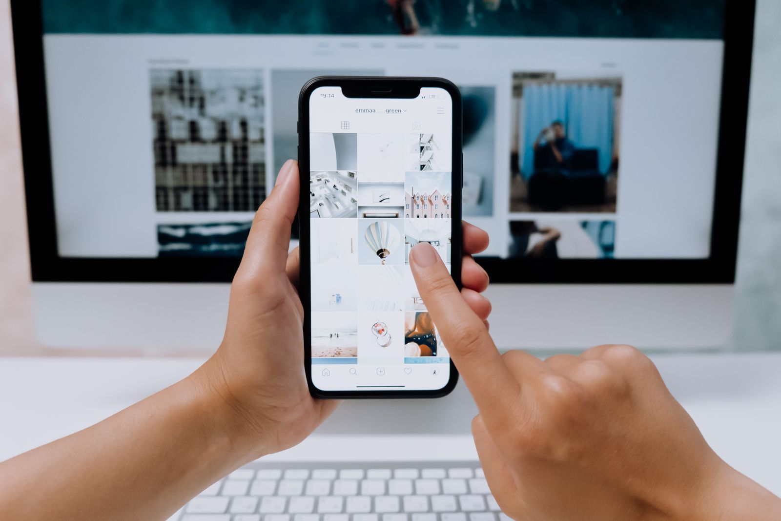
On a phone, your number should be a link that starts a call with one tap. It sounds small, but it is one of the most used buttons on any local business website.
6. Customers Can Book Online
If your business takes appointments, let customers book them online, at any hour. Many people decide in the evening and would rather not call. Online booking catches them while they are ready. We explain how to set it up properly in our guide to online appointment booking.
7. Your Forms Are Short and Go Somewhere
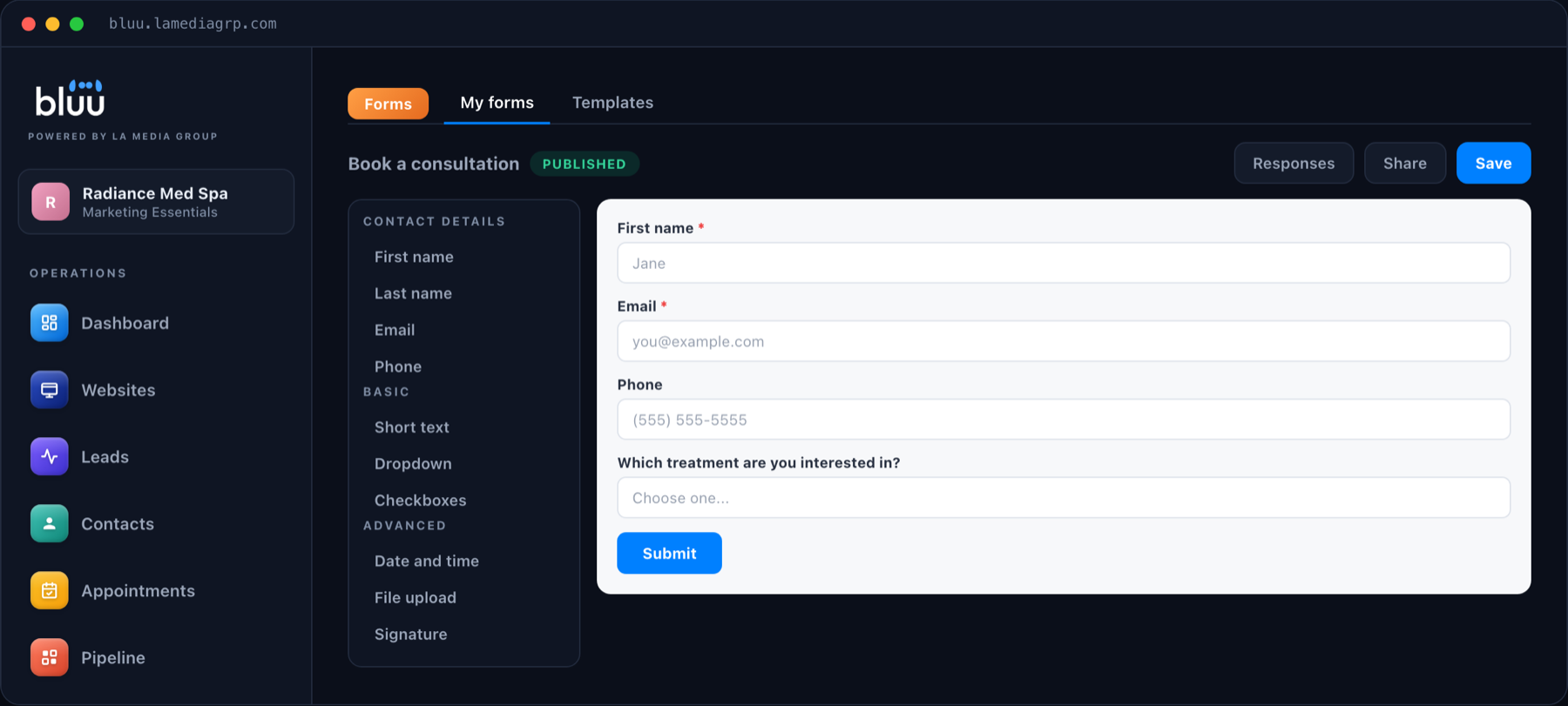
Ask only what you need: a name, a way to reach them and what they need help with. Every extra field loses people. Just as important, every form submission should land in one inbox your team actually watches, and become a contact in your CRM automatically, so no enquiry is ever left sitting in an email folder.
8. Visitors Can Ask a Question Right Now
A visitor with a question will not wait until tomorrow. A chat window on your site, ideally one with an AI that answers from your own information at any hour, catches those questions and captures the visitor's details. Read more in our guide to AI chat for your website.
9. Your Reviews Are Front and Center
People trust other customers more than they trust you. Show real reviews on your homepage and service pages, and make it easy for happy customers to leave new ones. Our Google reviews playbook covers how to get more of them.
10. The Photos Are Real
Stock photos have their place, but nothing builds trust like your actual team, your actual premises and your actual work. Even a few good phone photos of real jobs will outperform a page of generic images.
11. Search Engines Can Understand It
Every page needs a clear title, a meta description, one main heading and headings that describe each section. Use the words your customers search for, such as your service and your town, naturally in the text. Make sure your business name, address and phone number are the same everywhere they appear online.
12. You Can Change It Without a New Quote
A website that never changes slowly goes out of date: old prices, past events, staff who left two years ago. Choose a setup where you can get changes made quickly, without a new invoice every time you need a new page or photo.
A website is not finished on launch day. It is finished when it stops bringing in customers, and the good ones never do.
Bonus: You Can See What It Is Doing
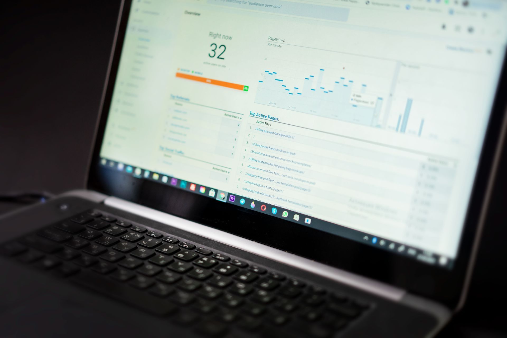
Finally, you should be able to see, in plain numbers, how many people visit, how many get in touch and where they came from. Without that, you are guessing whether your website, and the marketing pointing at it, is working.
Talk to a real person
Want a Website Built Around All Twelve?
On a 20 minute call we will look at your current site with you and show you exactly what we would change. Month to month, with no contracts.
Common Website Design Mistakes
These come up on almost every small business website we are asked to look at. Each one quietly costs enquiries.
- A slider on the homepage. Rotating banners push the important message off screen and most visitors never see the second slide.
- Clever headlines."Where passion meets excellence" tells a visitor nothing. Say what you do and where.
- The contact page as the only way in. Put a clear next step on every page, not just one.
- Walls of text. Short paragraphs, clear headings and lists make a page easy to scan on a phone.
- Pop-ups that appear immediately. Let people read before you ask them for anything.
- Outdated information. Old prices, past events and missing staff make a business look closed.
- No way to tell what is working. Without visitor and enquiry numbers, you cannot improve anything.
Fixing these rarely needs a new website. Most can be corrected in an afternoon, and the difference in enquiries is often noticeable within weeks.
How We Design Small Business Websites
At LA Media Group, every website we build is designed around these twelve points from the start, and every site comes with Bluu, the dashboard where your forms, bookings, chat, reviews and leads all come together. Changes are included, so your website keeps up with your business.
Our website plans start at $399 a month with a one time $799 setup that covers the design, the build, going live, and the licensing and cloud storage. It is month to month, with no contracts. See every plan on our pricing page, or read our breakdown of what a small business website really costs.
A Quick Small Business Website Design Checklist
Use this to check your current site in ten minutes:
- It looks right and is easy to use on a phone
- It loads quickly
- The first screen says what you do, where, and how to reach you
- Every page has one clear next step
- Your phone number is tappable
- Customers can book online
- Forms are short and land in one inbox
- Visitors can ask a question by chat
- Reviews are visible
- Photos show your real business
- Every page has a proper title and description
- You can get changes made quickly
Frequently Asked Questions
What makes a good small business website design?
A good small business website is fast, works perfectly on a phone, tells visitors what you do and how to reach you within seconds, and gives every page a clear next step such as booking or calling. Design should serve those goals, not compete with them.
How many pages does a small business website need?
Most local businesses need a homepage, a page for each main service, an about page, a contact page and any location pages, plus legal pages. A page for each service also helps you appear in search for each one.
Should my website have online booking?
If your business takes appointments, yes. Online booking captures customers who decide outside business hours and would rather not call.
Do I need a chat on my website?
It helps. A chat window, especially one with an AI that answers from your own information, catches visitors with questions at any hour and captures their contact details so you can follow up.
How often should I update my website?
Whenever something changes, such as your services, prices, team or hours, and at least every few months to keep content fresh. Choose a setup that makes changes quick and does not charge a new quote every time.
Do I need a new website, or can my current one be fixed?
Often it can be fixed. Many of the twelve points, such as a clear first screen, tappable phone number, short forms and visible reviews, can be added to an existing site. A rebuild makes sense when the site is slow, hard to change or does not work well on a phone.
The Bottom Line
Small business website design that converts comes down to a short list: built for the phone, fast, clear about what you do, one obvious next step on every page, and every enquiry landing somewhere your team will see it. Get those right and your website stops being a brochure and starts being your best salesperson.
If you would like a second opinion on your current site, book a call or send us a message.